Fix it and make it perfect


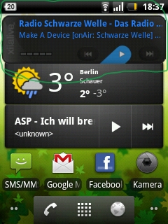
above:the problem with the too big widget
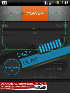
middle: only original design I cant see(the rest)
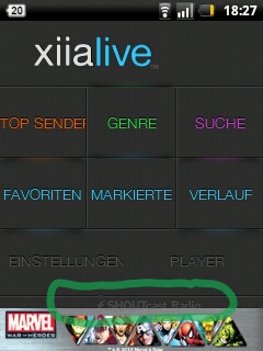
downstairs: down is shoutcast radio easily removed, even without advertising and by top Sender, the r, is gone half.
my device: http://www.inside-handy.de/handys/vodafone_858-smart/2471_allgemein.html
Android 2.2.1.
Please write when you have question
greetz from germany
Vasta

Wow! Very squished! Thanks for the images it really helps understand the issue. What device do you have?

please read the text ;) , i think have you forgot.
my device: http://www.inside-handy.de/handys/vodafone_858-smart/2471_allgemein.html
Huawei Vodafone 858 with Android 2.2.1
the word "top Sender", Sender one is pushing down with the \n\n that goes with it?(i am translater by xiia live)

Oh man! Sorry :/ completely missed the link! I think I need to modify the code in order for the Top Sender to be a two line text, using \n will not work.
About the original skin design for the player on your phone... we might unfortunately have to disable it for small phones.. :( since it's just not possible to fit all that info in a tiny screen.

Yep! Might have to create completely new widgets to solve this issue.... :)
Customer support service by UserEcho


Wow! Very squished! Thanks for the images it really helps understand the issue. What device do you have?