0
Prévu
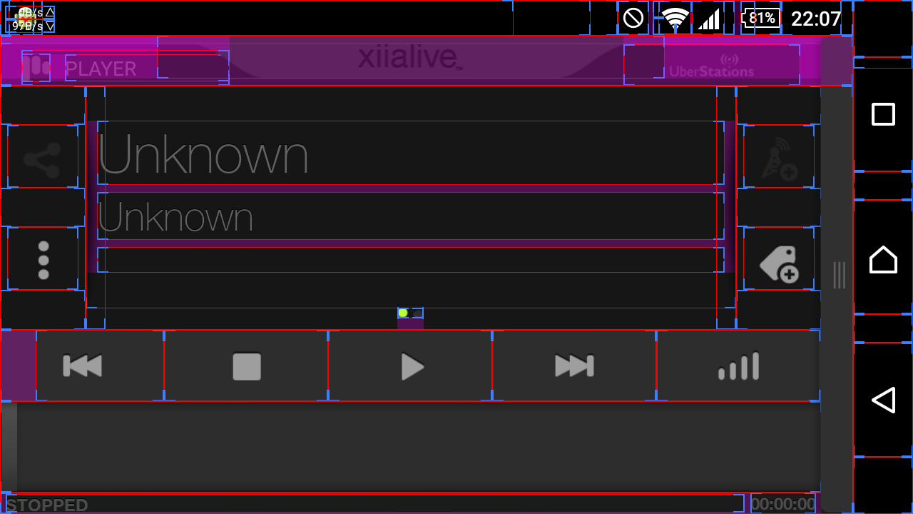
Buttons in the player are too sensitive
Buttons are too sensitive in Classic Dark theme. In developer mode, I enabled "Show layout bounds" and i see you make the buttons area to long. Can you remove the 'padding' thing and make it margin area between buttons instead, like you did make margin area between share and 3 dots buttons?

Solution

Solution
Prévu
Hi Evildog,
actually it's part of our to-fix list.
Thanks.
Service d'assistance aux clients par UserEcho


Hi Evildog,
actually it's part of our to-fix list.
Thanks.