+2
À l'étude
Android Design Guidelines
I wish to invite whoever is designing your graphics to read the Android design guidelines. This way not only will you be able to create an interface layout compatible with all screen sizes (as from your admission you are having troubles fitting smaller screens) but also one that fits with the new aesthetics introduced in Ice Cream Sandwich. I believe it would also allow adding more features easily.
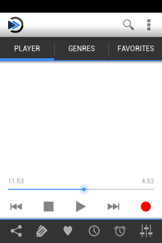
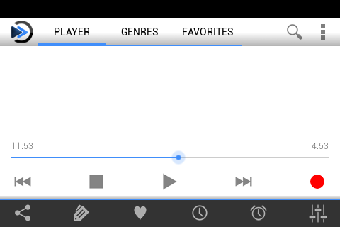
As a very basic example, I have come up with one portrait and one landscape view of a possible interface as it would be displayed on an HTC Wildfire S (MDPI).

The bottom row of icons are Share, Tag (Tag song), Favorite (Favorite station), Sleep timer, Alarm and Equalizer. I have used the default icons but you can use the ones provided in the beta version as they are more appropriate.

The white space would be filled with station related info, and advertisement for the Lite version.
Action overflow would contain things such as Settings at all times, as well as things not as important based on the active screen. Note that the Action overflow would disappear on pre-Honeycomb Android devices as the Menu key will perform the same function.
Overall though, try to understand the design guidelines. They contain many useful tips for designing a strong interface, and I'm far from an expert myself.
Also, to be honest: I am using an overclocked HTC Wildfire S (800MHz on Cyanogen 7.2 vs stock 600MHz with HTC Sense) and the current interface for the beta lags as all hell, even with animations disabled. A Holo based UI (Which has less animations overall) would perform much better on low end hardware.
Also, while you are reading this: the beta force closes immediately on me as soon as the Play button is pressed. Unrelated but I'd rather not spam the place.
As a very basic example, I have come up with one portrait and one landscape view of a possible interface as it would be displayed on an HTC Wildfire S (MDPI).

The bottom row of icons are Share, Tag (Tag song), Favorite (Favorite station), Sleep timer, Alarm and Equalizer. I have used the default icons but you can use the ones provided in the beta version as they are more appropriate.

The white space would be filled with station related info, and advertisement for the Lite version.
Action overflow would contain things such as Settings at all times, as well as things not as important based on the active screen. Note that the Action overflow would disappear on pre-Honeycomb Android devices as the Menu key will perform the same function.
Overall though, try to understand the design guidelines. They contain many useful tips for designing a strong interface, and I'm far from an expert myself.
Also, to be honest: I am using an overclocked HTC Wildfire S (800MHz on Cyanogen 7.2 vs stock 600MHz with HTC Sense) and the current interface for the beta lags as all hell, even with animations disabled. A Holo based UI (Which has less animations overall) would perform much better on low end hardware.
Also, while you are reading this: the beta force closes immediately on me as soon as the Play button is pressed. Unrelated but I'd rather not spam the place.
Solution

0
Solution
À l'étude
Jona (Lead Developer) il y a 14 ans
Thanks for taking the time to provide us with your feedback. We are aware of the Android UI Guidelines and understand it makes design and layout flexibility much easier across screen sizes and densities.
We aren't using those methods because we are all about trying to make something that stands out. This idea we have comes with a complexity price to pay. We appreciate your feedback and will take it into account. I sent link of this post to the graphics designer to read ;)
In regards to the crash issue you are seeing. This seems to be due to your custom ROM. It is crashing because it can't init the EQ. This I read on some forums that it was an issue. I still have to investigate a little more.

Solution
À l'étude
Thanks for taking the time to provide us with your feedback. We are aware of the Android UI Guidelines and understand it makes design and layout flexibility much easier across screen sizes and densities.
We aren't using those methods because we are all about trying to make something that stands out. This idea we have comes with a complexity price to pay. We appreciate your feedback and will take it into account. I sent link of this post to the graphics designer to read ;)
In regards to the crash issue you are seeing. This seems to be due to your custom ROM. It is crashing because it can't init the EQ. This I read on some forums that it was an issue. I still have to investigate a little more.

+1
It may be a good idea to have a theme that follows the new guidelines, but not set it as default?
The Android spec mockups look very clean, straightforward, and easy to use, but the default XiiaLive theme is much cooler...
The Android spec mockups look very clean, straightforward, and easy to use, but the default XiiaLive theme is much cooler...

It's now a 1 year old suggestion, and there is still no such sort of theme. I know you didn't said it will be made, but it would better fit if there was a more android centric theme available. Hope it's still coming, it's one of the things I miss the most.

It's been a while since this post. Unfortunately our graphics designer hasn't had time to work on a new theme...mainly because he is part-time with us. If we do get funding for sure we would try doing more themes. At the moment working on some bigger awesome features I can't disclose yet... :)

So, it's still not there, but nice to hear some news about it. Still have to wait though. It's clear that's not a very important feature, so we can wait a bit for it and hope that those others awesome features are even better than a theme ;)

IMHO, Android design guidelines are stupid... though it helps to have all the apps following the same stupid design and not having to learn a new interface for each app.
Now, on the other hand... I find the current design... excuse me, nothing personal, it's just a matter of taste... I find it cheesy. Apps that follow some of the Google guidelines achieve a more pro-looking, clean interface.
Your app will stand out not by it looks (you can add your "touch" nonetheless) but by its features.
Service d'assistance aux clients par UserEcho

